Navigation
Install the app
How to install the app on iOS
Follow along with the video below to see how to install our site as a web app on your home screen.
Note: This feature may not be available in some browsers.
More options
Style variation
You are using an out of date browser. It may not display this or other websites correctly.
You should upgrade or use an alternative browser.
You should upgrade or use an alternative browser.
Initial Suggestions and Feedback
- Thread starter kinboshi
- Start date


darkmode
darkmode darkmode
darkmode darkmode
there's no darkmode!
Sung to the tune of
I mean, I hate to be the guy but you missed a darkmode before 'there's no darkmode'
Genius lyrics though, I'll never work out how they came up with them.
I may have found this thread by searching for 'dark mode'
Because there's no dark mode.
Nurnurnurnurnernur
Could we get some sub-forum filters in the "New Posts" page?
This is the default page I tend to use when seeing what posts I've not read, but as the forum expands I, as a GR Yaris owner (in waiting), will have no interest in what exhausts people are putting on their GR86's (no offense future 86 owners).
Even if the filters were just the 7 main sub-forums listed in the header, people could turn off the "GR Supra", "GR86" etc to better suit their interests. I would suspect this to be an option other users would appreciate as this forum is naturally less "focused" on one subject compared to others.
Of course a bonus would be to have the filters save even after clicking in to a thread and then returning to the "New Posts" page, otherwise it would be like the Yaris switch-on procedure, clicking 5 buttons before I can actually navigate
This is the default page I tend to use when seeing what posts I've not read, but as the forum expands I, as a GR Yaris owner (in waiting), will have no interest in what exhausts people are putting on their GR86's (no offense future 86 owners).
Even if the filters were just the 7 main sub-forums listed in the header, people could turn off the "GR Supra", "GR86" etc to better suit their interests. I would suspect this to be an option other users would appreciate as this forum is naturally less "focused" on one subject compared to others.
Of course a bonus would be to have the filters save even after clicking in to a thread and then returning to the "New Posts" page, otherwise it would be like the Yaris switch-on procedure, clicking 5 buttons before I can actually navigate

- Nov 22, 2021
- 1,518
- 2,582
Could we get some sub-forum filters in the "New Posts" page?
This is the default page I tend to use when seeing what posts I've not read, but as the forum expands I, as a GR Yaris owner (in waiting), will have no interest in what exhausts people are putting on their GR86's (no offense future 86 owners).
Even if the filters were just the 7 main sub-forums listed in the header, people could turn off the "GR Supra", "GR86" etc to better suit their interests. I would suspect this to be an option other users would appreciate as this forum is naturally less "focused" on one subject compared to others.
Of course a bonus would be to have the filters save even after clicking in to a thread and then returning to the "New Posts" page, otherwise it would be like the Yaris switch-on procedure, clicking 5 buttons before I can actually navigate
We should be able to do some of what you've suggested.
I've just added under New posts a sub-menu for GR86 Latest - is that what you mean?
We would obviously also do the same for other models if it makes it easier to navigate.

If that sub-menu page showed the equivalent to the "New Posts" page but just for the GR86 section, then yeah that would make it easier definitelyWe should be able to do some of what you've suggested.
I've just added under New posts a sub-menu for GR86 Latest - is that what you mean?
We would obviously also do the same for other models if it makes it easier to navigate.


- Dec 27, 2021
- 1,738
- 2,880
Agree that the logo is good, having the OO part of the logo as site favicon isn't a bad idea though.Logo won't be changing, but other suggestions will be considered over time. Thanks for your input.
I mocked it up and it works well at 16x16, quite distinctive and better than whatever is there at the moment (is it a rev counter?)

MasterVentris
Dedicated member
- Dec 16, 2021
- 107
- 140
Dark mode beta is now available!
There is now a theme selection menu in the red bar on the footer, you may switch between "GR Zoo" and "GR Zoo - Dark (Beta)".
Please provide feedback on it, especially any places where content is hard to read on its background. I think I have the most commonly used area of the site in a good state, but I'm sure you guys use things I don't!

The picker is down here above the footer:
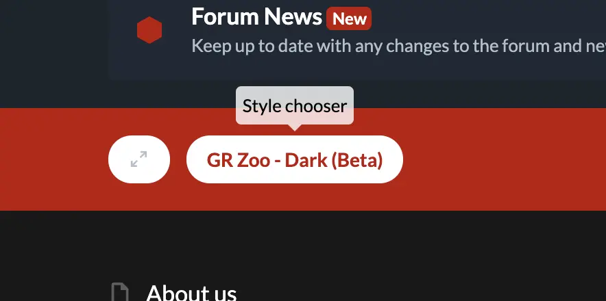
There is now a theme selection menu in the red bar on the footer, you may switch between "GR Zoo" and "GR Zoo - Dark (Beta)".
Please provide feedback on it, especially any places where content is hard to read on its background. I think I have the most commonly used area of the site in a good state, but I'm sure you guys use things I don't!
The picker is down here above the footer:

marcusfordus
Absorbed member
Nice and easy on the eyes nowDark mode beta is now available!
There is now a theme selection menu in the red bar on the footer, you may switch between "GR Zoo" and "GR Zoo - Dark (Beta)".
Please provide feedback on it, especially any places where content is hard to read on its background. I think I have the most commonly used area of the site in a good state, but I'm sure you guys use things I don't!
View attachment 1064
The picker is down here above the footer:
View attachment 1065


Lauren
Totally Hooked
Excellent. Well done, Matt. Only thing that is a little hard to read is the text in red.
- Thread starter
- #58
NormalIs the main text bolded, or just a heavy font by default?
I'd also agree mostly on the red as well, but loving having dark mode back!
Bold
Not much of a difference, so the standard font is quite heavy
